
What is it us Disney videocassette collectors love so much about this line?
Is it because it's the first line meant for the Disney animated classics on home media? Is it because the line is actually pretty important in the history of The Walt Disney Company? Is it because of the great cover artwork that was done for these releases? Perhaps that is all one reason...
The Classics line was launched in December 1984, though a few Disney animated films were available on home media formats prior to that. Dumbo and Alice in Wonderland - films shown in edited form on television when Walt Disney was alive - were two of them, some package features made up the rest. The Disney management in the 1970s and 1980s mostly balked at the idea of releasing these films on the format, relegating them to the small screen and ending their theatrical lives.
But gone were the days that the classic animated movies had to be re-issued every 6-10 years. More and more consumers around the world were buying up video releases (mainly VHS), and Disney was beginning to catch on to this. The Cartoon Classics "Limited Gold Edition" line - launched in the summer of 1984 - would be a test to see if consumers would buy up videos that were going to disappear... And they did. Thus, the Classics line would be launched shortly afterwards.
There was still some hesitation... Robin Hood was the title that started the line, being a film that wasn't in the higher echelons of the Disney Animation league. Disney figured that they'd test the waters with a "lesser" feature, but the title sold well. However, by the time Robin Hood was released on home video, Disney had changed. New management was in, namely the likes of Michael Eisner, Frank Wells, Jeffrey Katzenberg, et al.
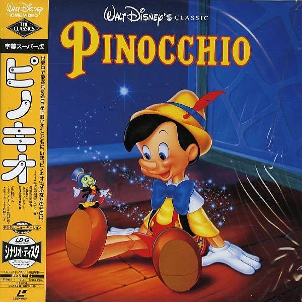
The new management saw potential in home video, and made Pinocchio the next Classics title. That sold very well after a price fix during the holidays of 1985, and as new releases came, sales went up and up and up and up!
Those sales were what helped animation rocket its way to a new Golden Age... Pinocchio sold over half a million units in 1985 and 1986, which was great for the time. Sleeping Beauty was a record-breaker in fall 1986, selling over a million units. Lady and the Tramp once held the record for most pre-orders. Disney would then back these new Classics titles up with huge holiday promotions: Tons of other titles - live-action films/cartoon compilations/etc. - would be released around them.
The rest is history. Before the Classics line closed out in early 1994, contemporary films Beauty and the Beast and Aladdin smashed records alongside much-anticipated older films like Fantasia and 101 Dalmatians. This all occurred between 1991 and 1993, and that was only the beginning...
However, what's another reason we love The Classics line in particular? Why do some of us folk somewhat favor it over the Masterpiece Collection? Or the current Platinum and Diamond collections?
A reason I love it...

The logo.
Yes, everybody knows and loves that shiny black diamond with 'The Classics' written in an almost 1930s Art Deco-esque font inside it...
Speaking of the font, don't you think it gives off a sort of Golden Age of Hollywood vibe? I associate a font like that with the 1930s or 1940s even, like I said, Art Deco. I associate it and the b&w diamond with black-and-white films, the music of the era, the automobiles of the era... And it's fitting, considering that some of the greatest Disney animated classics came out during Hollywood's Golden Age. Almost all of Walt's animated films were made during this era, which some argue ended in the early 1960s... Walt's last would be released in 1967...
Sure, this could be some random diamond that says "The Classics" in it, but I think it works because of the whole Golden Age connection. Using just "Walt Disney Home Video" would be a bit on the bland side.
In other countries, they wouldn't use a diamond, but rather a scroll or just plain text...


The star on the 2003 UK Pinocchio VHS and of-the-era releases adds a nice touch, while I don't care for what is used on the earlier UK VHS tapes, which you see on my UK Jungle Book VHS cover from 1993. These two headings were used mostly throughout Europe. European Disney VHS tapes wouldn't use the Classics logo in any form...
Well, there were a few slight exceptions: Some British tapes released in 1992 used the animated intro logo (which was the 1992 super-blue version of the 1988 Walt Disney Classics logo), but the logo would be part of the preview reel before the film. The logo preceding the feature itself would be the 1986 Walt Disney Home Video logo.
Japan, however, used their own unique version of the Classics logo. This one combines that sort of 30s feel with a more contemporary, spacey, 80s one...

A more simple animated intro, and it would appear on the packaging as well.
The first animated version of the logo itself of course debuted on North American releases. Instead of using the then-current "Neon Mickey" Walt Disney Home Video logo, The Classics line got its own logo... With what effects they had, the result was this...
A bit rough around the edges you could say, but at the same time it makes the Classics logo look like a neon sign... The music is fitting too, triumphant horns celebrating the classic film you are about to watch! Not too bad on the ears, unlike some loud 70s and 80s logos out there (Paramount Home Video 1979 logo, I'm looking at you!), including that aforementioned Neon Mickey logo!
The next logo would be even more successful, visually and musically...
Using the opening animation from the rather crisp and clean 1986 Walt Disney Home Video logo, the people behind this ident outdid themselves. For a logo made in 1988, it's still pretty to look at... In all three variations!


This logo, with its more advanced visuals, really keeps the 30s/Hollywood aesthetic with the "Classics" text. It's much closer to the font used on the packaging...
The music accompanying it is also a delight, very upbeat and peppy. Certainly a 180 from the low-key, more synthy and perhaps minimal-sounding WDHV theme. It seems like the composer of that music had something huge in mind, as this is a line dedicated to the very films that pretty much define Disney. Then again it could be public domain music that was sitting around for years...
For me, those are the reasons I love this series. The Walt Disney Masterpiece Collection definitely feels a little more modern. The logo is a more simple design, with a more simple font for "Masterpiece Collection". The music? It's just a remake of the 1988 Classics theme, and not its own new thing. That's not a bad thing, for it sounds nice in its redone form. The castle being in the logo design is cool, too... But it just doesn't hook me the way The Classics does.
The logo looks nicer on the spine of the case, but at the same time we lost the text being on top of backgrounds, the nice cover artwork.

After the Masterpiece Collection, we got the Gold Classic Collection. The logo, both in animated form and packaging form, does little for me. The Platinum Editions didn't have a spiffy logo, the Diamond Editions have nice headings for the Blu-ray/DVD covers, but that's about it.
Perhaps it's because the home media market was new in the 1980s, hence Disney going that extra mile. By the mid-90s, the home media market was more than commonplace. Not that they didn't continue making good logos or packaging for their films, but no logos stuck out like The Classics logo did, or the Masterpiece Collection logo even.
Around 2005 was when the Classics series was looked back on. A good ten years after its finale in the spring of 1994 (the last title being The Fox and the Hound), collectors went after them. Now they're really prized because they are now over 20 years old...
Why do you love The Classics line?
It is a fond memory, and the Classics plus several Masterpiece Collection installments were the avenues to which my generation was introduced to the Disney library. I, for one, would want to reboot the Walt Disney Classics as their answer to the Criterion Collection. At this stage, they now have the backlog of classic movies (I'm including movies that aren't animated, plus Lucasfilm's productions and a few others) to make it happen. Agree?
ReplyDeleteFYI, Jeffrey Katzenberg broke his arm in a car crash on Monday, but TMZ, for some reason, decided to report it now.
And something I read about that, he said the car's safety features saved his life. No matter how you feel about Katzenberg, it still seems scary at the idea of losing him the same way we lost Woolie Reithermann... and James Dean, my namesake.
DeleteI admired how timeless they feel, it seems like every time I watch one I feel like a child again. What catches my attention the most is the love and attention they put into the artwork of the covers, it could've been just a screenshot and the title like the Neon Mickey Tapes but they went the extra mile.
ReplyDeleteI grew up with the Classics collection, because that's what was in use when I was a little kid. Seeing the "Sorcerer Mickey" Classics logo at the start of the film was enough to get me pumped up; unlike the regular Walt Disney Home Video logo, this meant something big was about to start!
ReplyDeleteI never thought the font for the Classics logo looked 1930s-ish, but now that I look at it, it kinda does, adding to the "retro" feel for those classic Disney animated features.
The 1984 Classics logo is primitive in comparison. The music was clearly done on a Moog synthesizer, an instrument not fondly-remembered among logo fans (probably due to its' use in "scary" logos like the Screen Gems "S from H***" or the WGBH Boston theme.)
I always imagined what it'd be like if Disney continued the Classics line (including the newer Platinum/Diamond Edition releases of today), where we would have a beautiful new CGI high-def recreation of the 1988-1994 logo (probably animated by WETA Digital), still using the same 1988 theme!
The font for The Classics logo looked 1930s-ish During the Hollywood's Golden age.
ReplyDelete